PetCare is broadening the horizons of traditional pet care. I helped PetCare to reshape its user experience
In this project, I redesigned the user experience and crafted a new brand look for a pet health app. I joined the team and collaborated with engineers, a business analyst, and a product manager to deliver a scalable MVP.
Product Overview
PetCare is an app that helps pet parents track health information about their pets, easily search for pet services, and book appointments online. PetCare's key offerings include pet health cards, tracking, booking appointments, reminders, and search for services.
Goals
Craft a smooth and consistent user experience.
Prove value to pet owners quickly.
Demonstrate integration potential to vet clinics.
Incorporate new functionality.
My role was to design an MVP that would validate these assumptions with real users while building a foundation for future growth.
Looking at the current version
Here are the main problems with the core experience.

When the time came to add new features, it became evident that the app couldn't expand without compromising the user experience.
Confusing and misleading user experience.
For instance, the user-icon button on the top right corner leads to multiple functions: adding a new pet, opening a pet profile, and going to the app settings.

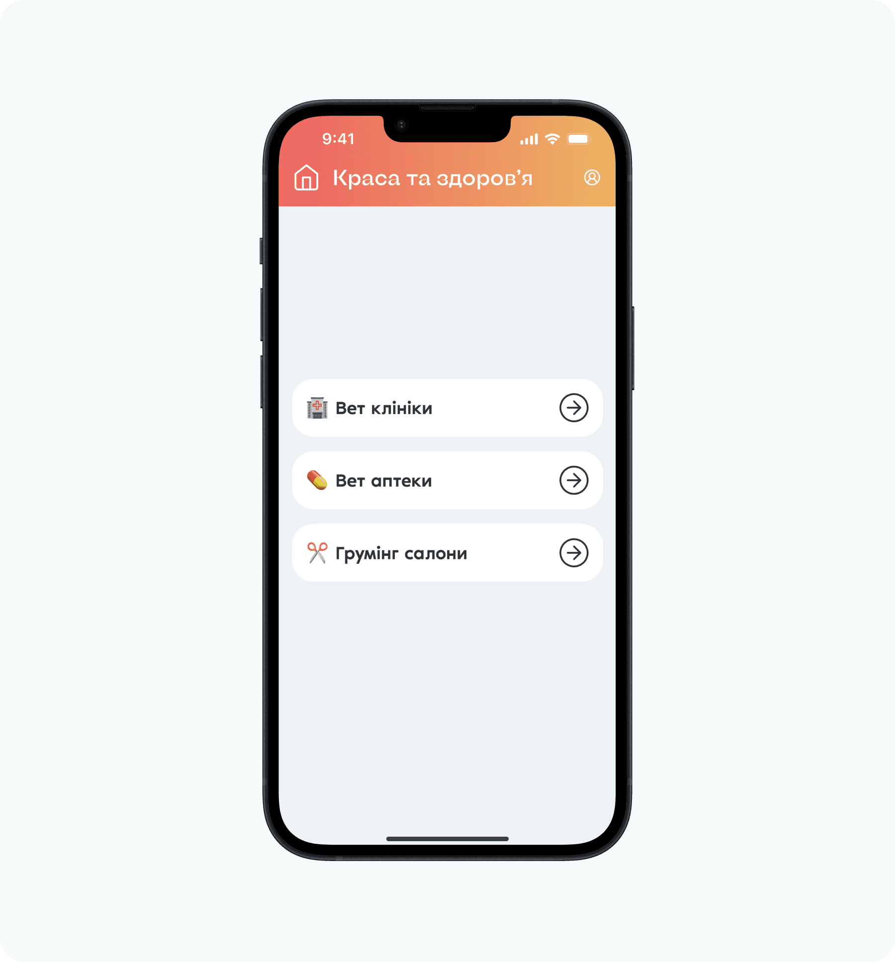
For instance, appointment booking feature isn't readily available on the main screen. Users have to navigate through two additional screens to find it buried under "Краса та здоровʼя" (Beauty and Health).
The impact achieved by the redesign
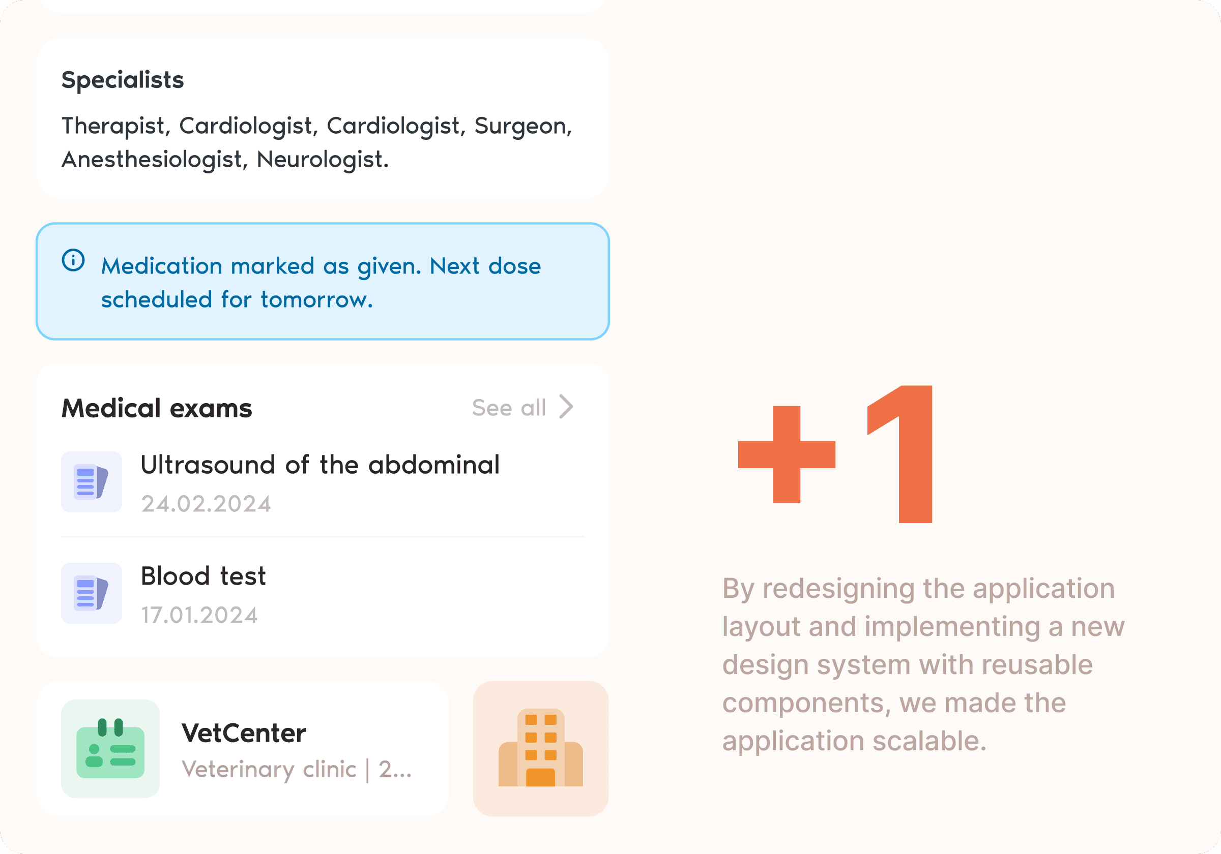
Although the development of the app is still in progress, we've already got some feedback from early users. Here is what we have.


Research phase
After familiarizing myself with the product, understanding the core issues, and learning about the team's goals, I conducted research with pet owners and veterinarians.
I explored pet owners' experiences booking appointments, visiting vets, and tracking pet health information. For veterinarians, I focused on their work with patients, common challenges, and any existing limitations.
Key insight: pet owners weren't just looking for a booking tool; they wanted peace of mind that their pet's health history was organized and accessible.
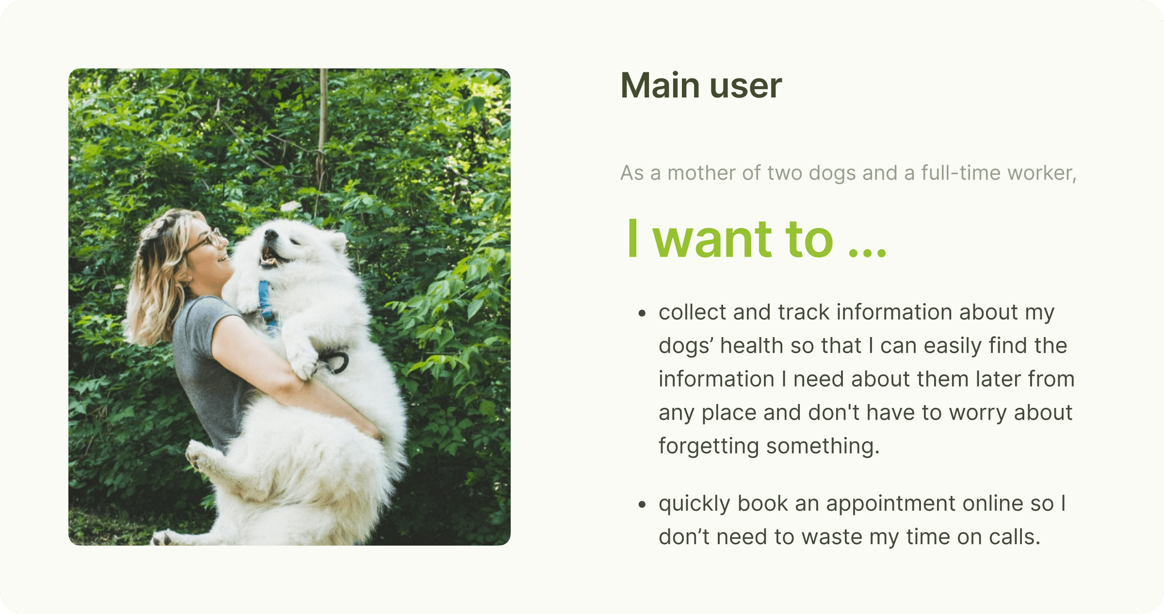
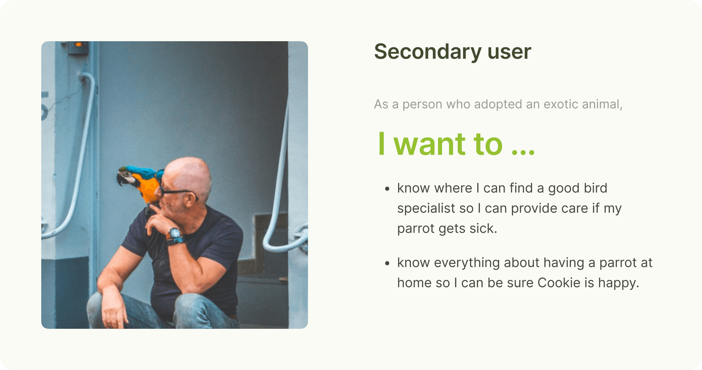
How might we help people reshape their experience in an easy and comfortable way while dealing with pet health?
This is one of the statement that helps us brainstorm as many ideas as we can. During these sessions we eventually came up with hypothesis of solutions that we might offer in order to improve user experience.
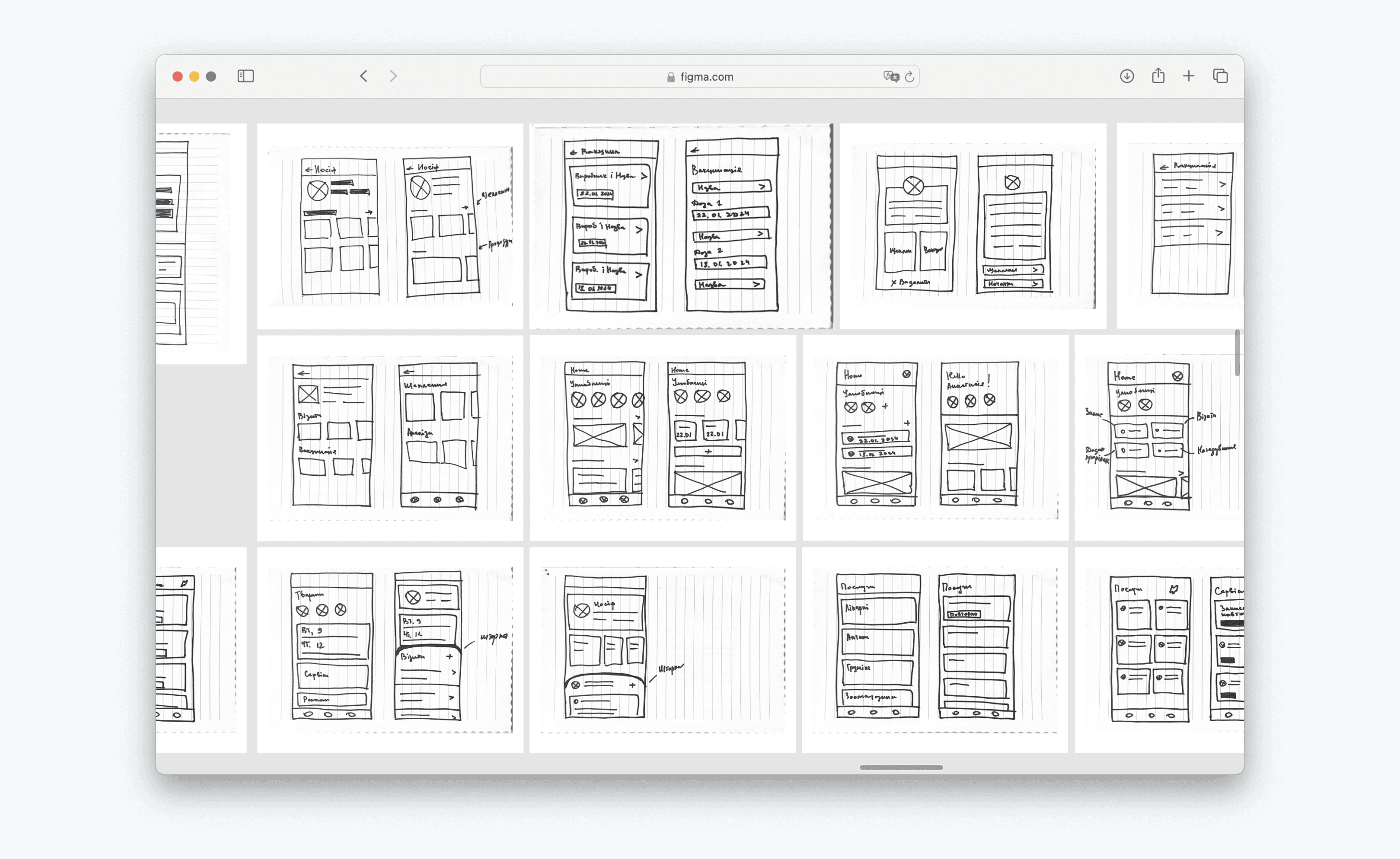
One of the biggest design challenges was information architecture. Pet owners often have multiple pets with different needs. How do we surface the right pet's information at the right time without making users think? That's why I explored 3 different navigation patterns and landed on the pet parent main profile because it reduced cognitive load and maintained flexibility.

Some of the wireframes we liked most were tested with users and selected for creating high-fidelity designs.
Afterward, these high-fidelity prototypes underwent another round of testing, where we identified areas for improvement in certain flows.
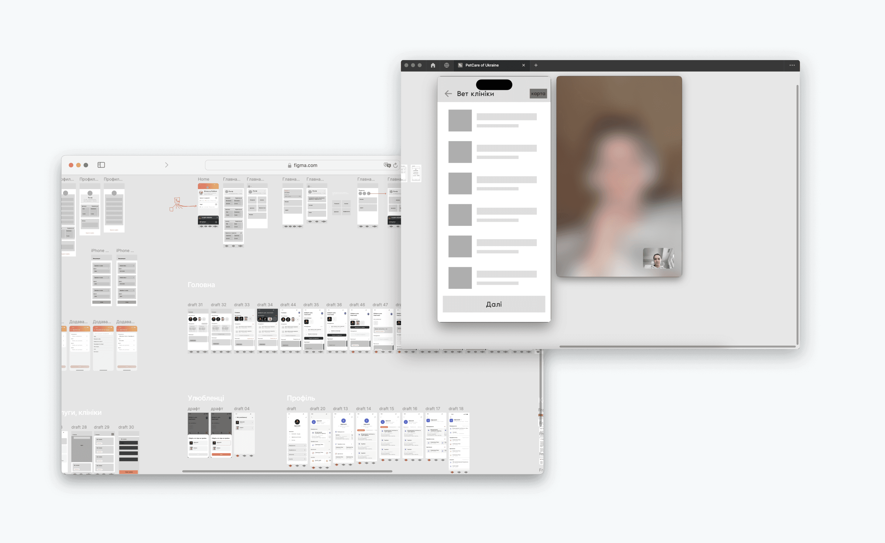
Test results
The testing focused on questions for PetCare's success:
Would users feel confident enough to complete bookings without talking to a human?
Would the app feel trustworthy enough for users to input sensitive pet health data?
Would the interface feel professional enough for future partnerships?
Here are examples of how testing revealed issues that could have hurt these goals:
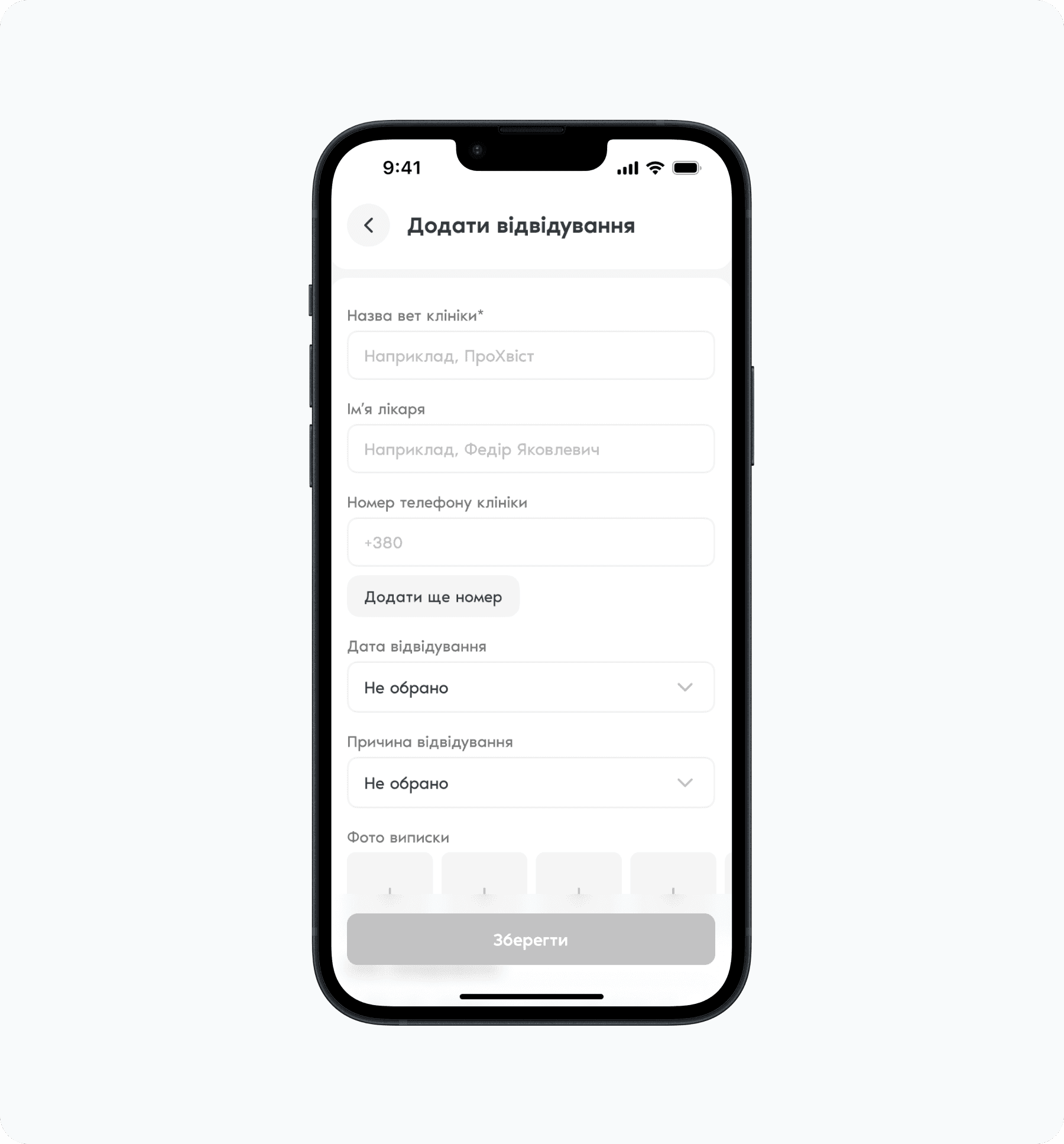
Although our primary goal was to upload all visits automatically from a vet's CRM, we still wanted to allow manual visit additions, requiring a convenient form.
The inactive grey CTA button in the form was confusing for some users; it was either not noticeable or did not indicate which fields were incomplete. I changed it to an always-active button, ensuring visibility and providing clear guidance in case of mistakes.
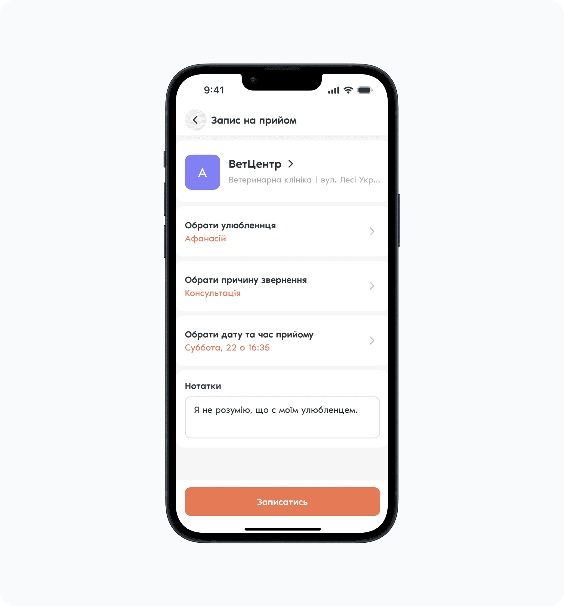
Additionally, I had to choose between a 3-step booking flow (faster) and a 5-step flow (more pet health context).
I tested both. Users preferred the 5-step version because it made them feel confident they were providing enough information for the vet, even though it took longer.
This taught me that speed isn't always the right optimization, because confidence and trust matter more in healthcare contexts.
Final work
Design system
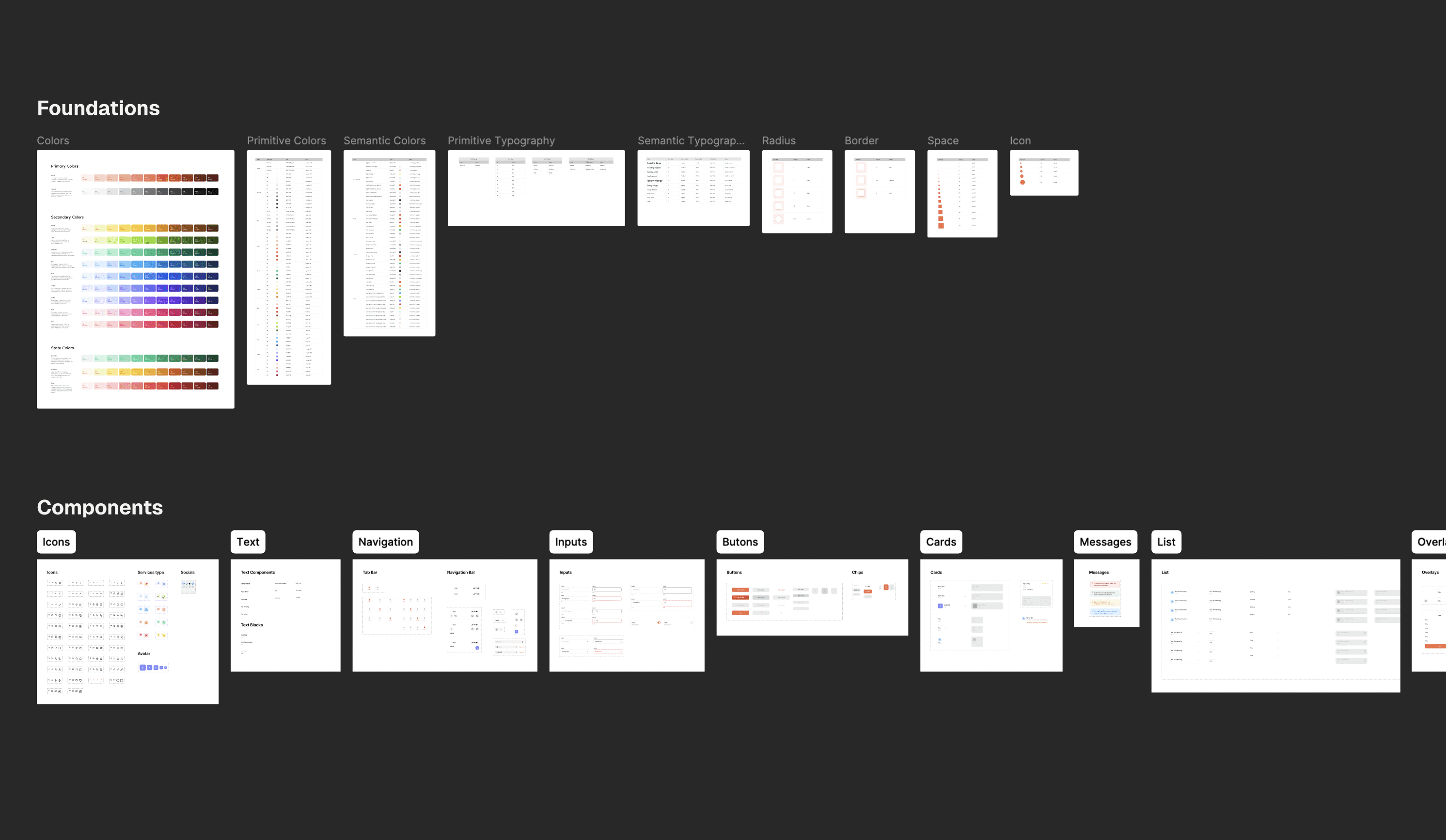
I created a PetCare design system that provides a grasp of brand identity and base components, that is scalable, and will allow to incorporate future elements easily.
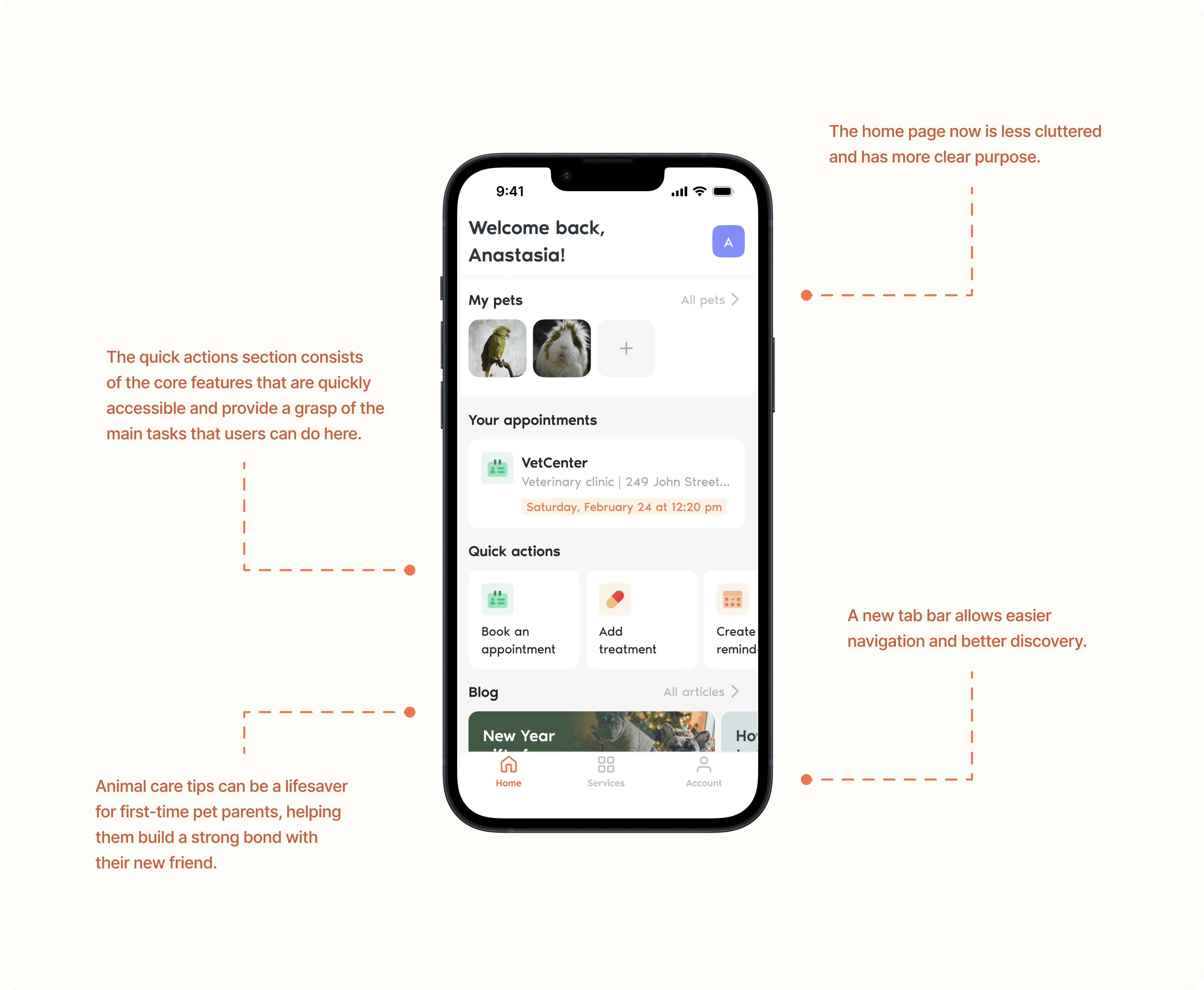
Home page redesign
The home page is now a dashboard where the user can see all the necessary information about all their pets, as well as manage it. Services and account settings are placed in separate tabs as they carry separate massive functionality.
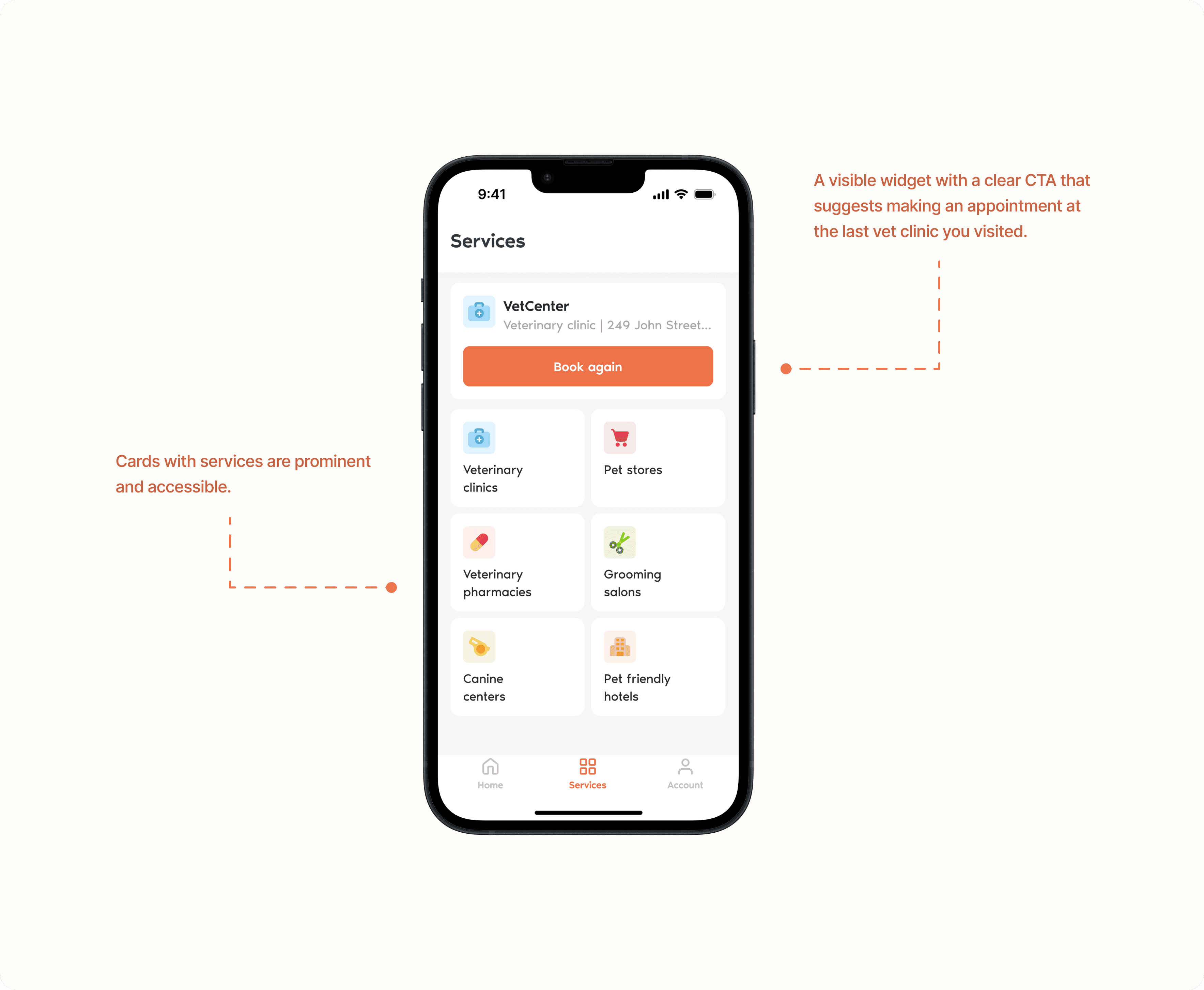
Services page
On the Services tab, the user now sees all the services presented. The application also remembers the last visit and, using the widget, offers to make an appointment at the same veterinary clinic. Thus, the user does not need to search for a veterinary clinic again every time.
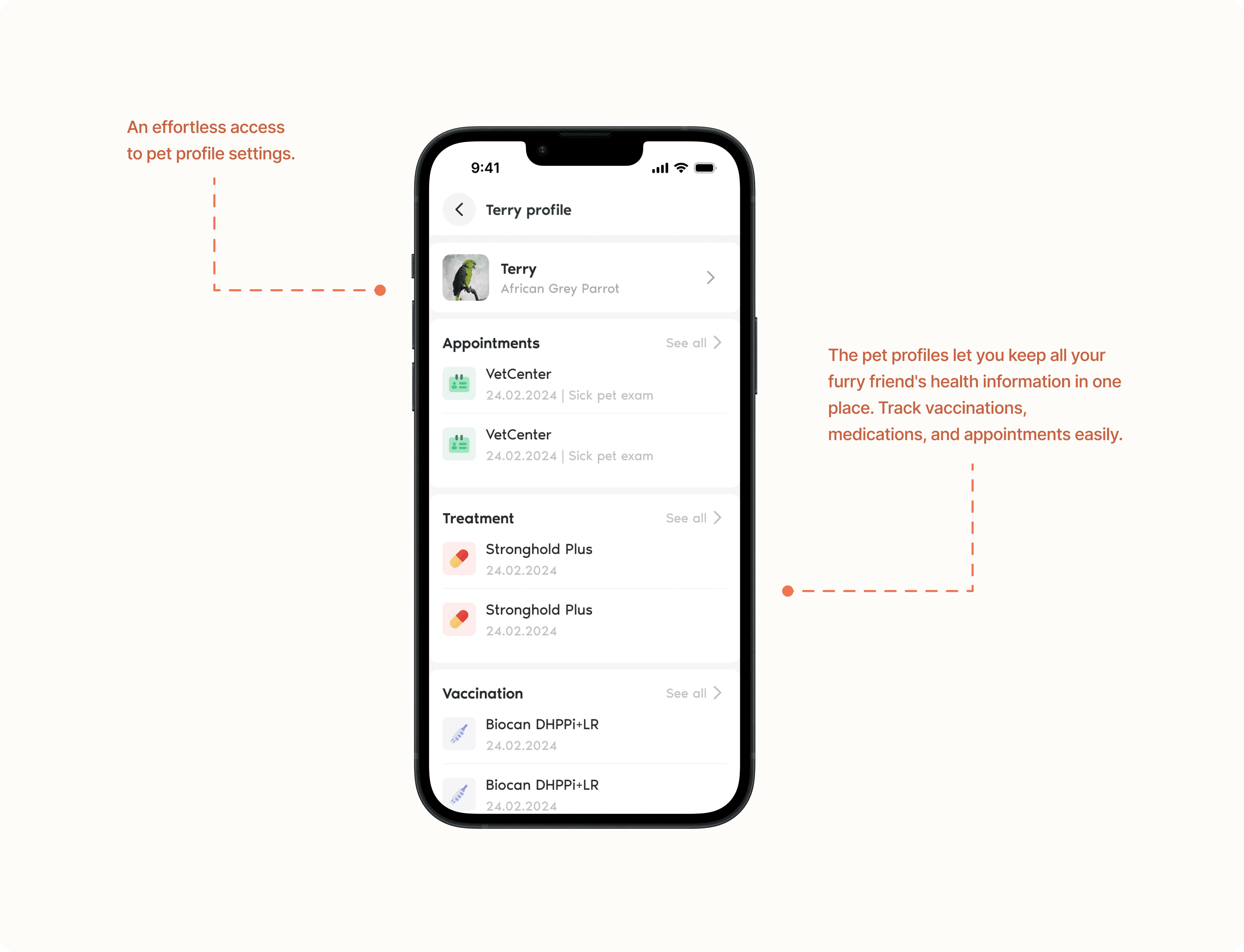
Pet profile
All information about a pet is now in one place. The user can easily view and manage it. The new pet profiles give users a central hub to manage their pet's health information, keeping them organized and in control.
Booking appointment
The challenge here was to design the vet clinic profile and appointment reasons flexibly enough to accommodate future integrations with vet clinics' CRMs when PetCare establishes closer collaborations with them.

